
UX Sketch
UX Wireframe with grid

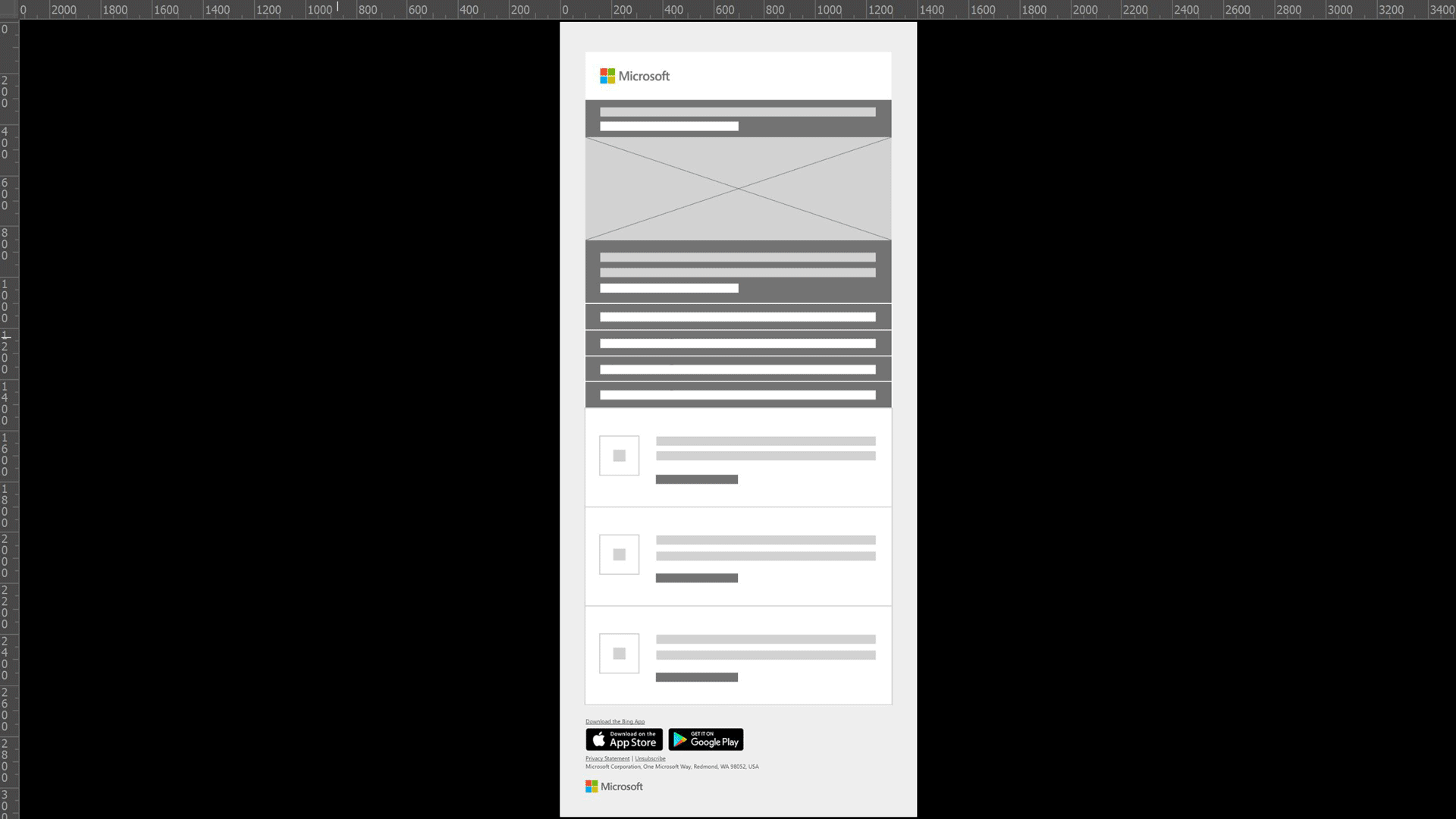
Newsletter design
Company: Microsoft
Role: Sr. Graphic Designer
Project: Redesign the UI/UX for Microsoft Rewards newsletter templates
Overview
Microsoft went through a major brand overhaul with the goal to make the creative more inclusive for customers who are color blind or have low vision. This tightened up the color palette and font selection which meant the templates I work from needed an overhaul as well including the Microsoft Rewards newsletter which is sent out to millions of customers around the world each month.
Goal
My team sent 1.9 Billion newsletters last year so these new templates needed to be robust while still adhering to the new guidelines. The marketers in the field were used to having a wide variety of styles and colors to choose from with the old brand so I needed to still give them flexibility for writing engaging content but within a much tighter scope. The new design also needed to be dynamically optimized across desktop, tablet, and mobile.
My Role
I spent several hours with Microsoft's brand team going over the new guidelines dialing in exactly how far I could stretch the boundaries while still staying on brand. After several sketching sessions, I transferred over to Figma and set up a foundational grid and got the main components for this newsletter laid out. I significantly simplified the content below the fold compared to previous newsletters because the old design was a mix of photography, random icons, and skeuomorphism which was now aesthetically outdated. With the opportunity to clear the slate, I kept the design as clean and straight forward as possible. Way easier for our customers to get their points more quickly.
Outcome
We instantly saw a significant increase in click-thru rates compared to the previous sends. According to user surveys, the best way to describe the way our customers felt now was relief. We knew our engaged users interacted with Microsoft Rewards newsletters because they wanted the most points as fast as possible and this gave them a quicker and cleaner way to do that. By utilizing the new brand and cutting the clutter, they had a smoother user experience and got to the important stuff with ease.